By Steph Sandhoff
We made it! We finally made it to Week 6 on The Block, past all those bedrooms and bathrooms. This week is Kitchen Week and if you didn’t know, kitchens sell houses. If I have to hear that one more time… Anyway, moving on, this week the couples saw their kitchen plans come to life after designing them back in Week 1. I always think this is interesting because it’s as if we’ve jumped back in time. The couples didn’t have the benefit of 6 weeks’ worth of feedback and experience, and often times hadn’t even found their style. It would be interesting to have the contestants plan their kitchens further into the next season and see if the results are of a higher quality. Regardless, all the couples did quite well this week, so let’s get started.
HOUSE 1 // Maddy and Charlotte
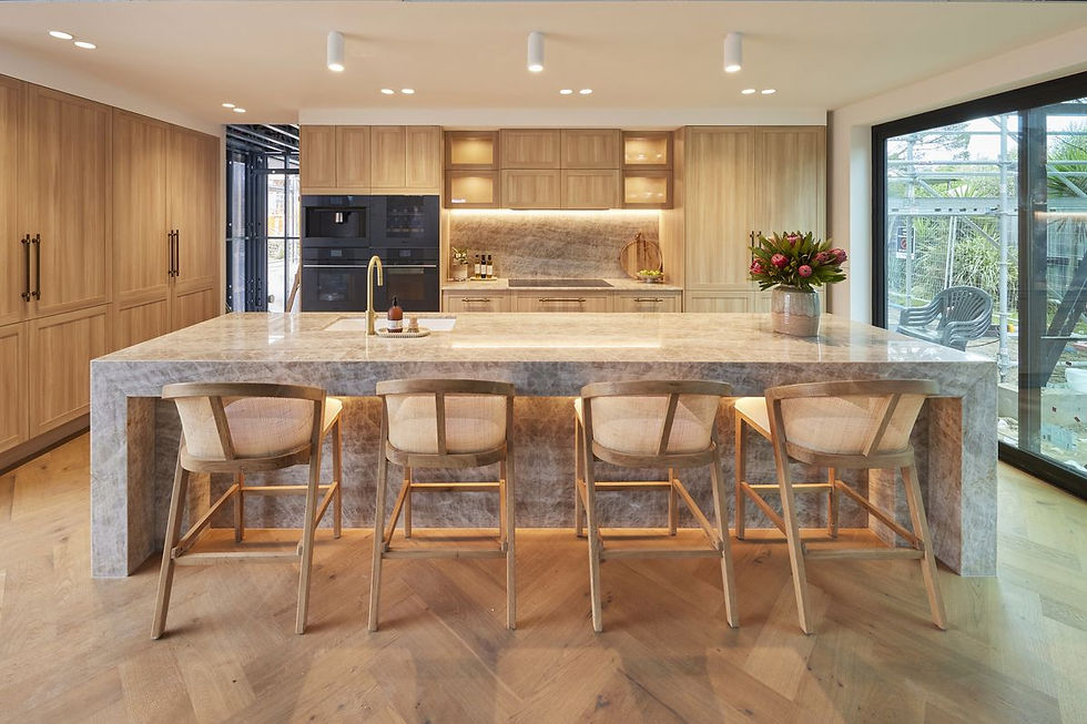
Photo Attribution: Nine
In House 1, we have Maddy and Charlotte, who have just experienced their first full week on The Block. Now this is a bit of a weird one, as it was Paige and Jesse who designed the majority of this kitchen. However, I don’t think that gives anyone the right to question the girl’s right to win. The judges had to judge the room in front of them and that is exactly what I am going to do, because the room in front of me is simply stunning. The word simple is important to note here, because the room is exactly that. We have no pendant lights and minimal styling but it’s also the limited materials palette that makes this kitchen feel so refined. We have one choice of stone, which we see used in both the island and splash back, the same cabinetry finish and profile throughout and a matching timber floor. This careful combination shows great restraint and has resulted in a kitchen that feels warm, calm and expensive.
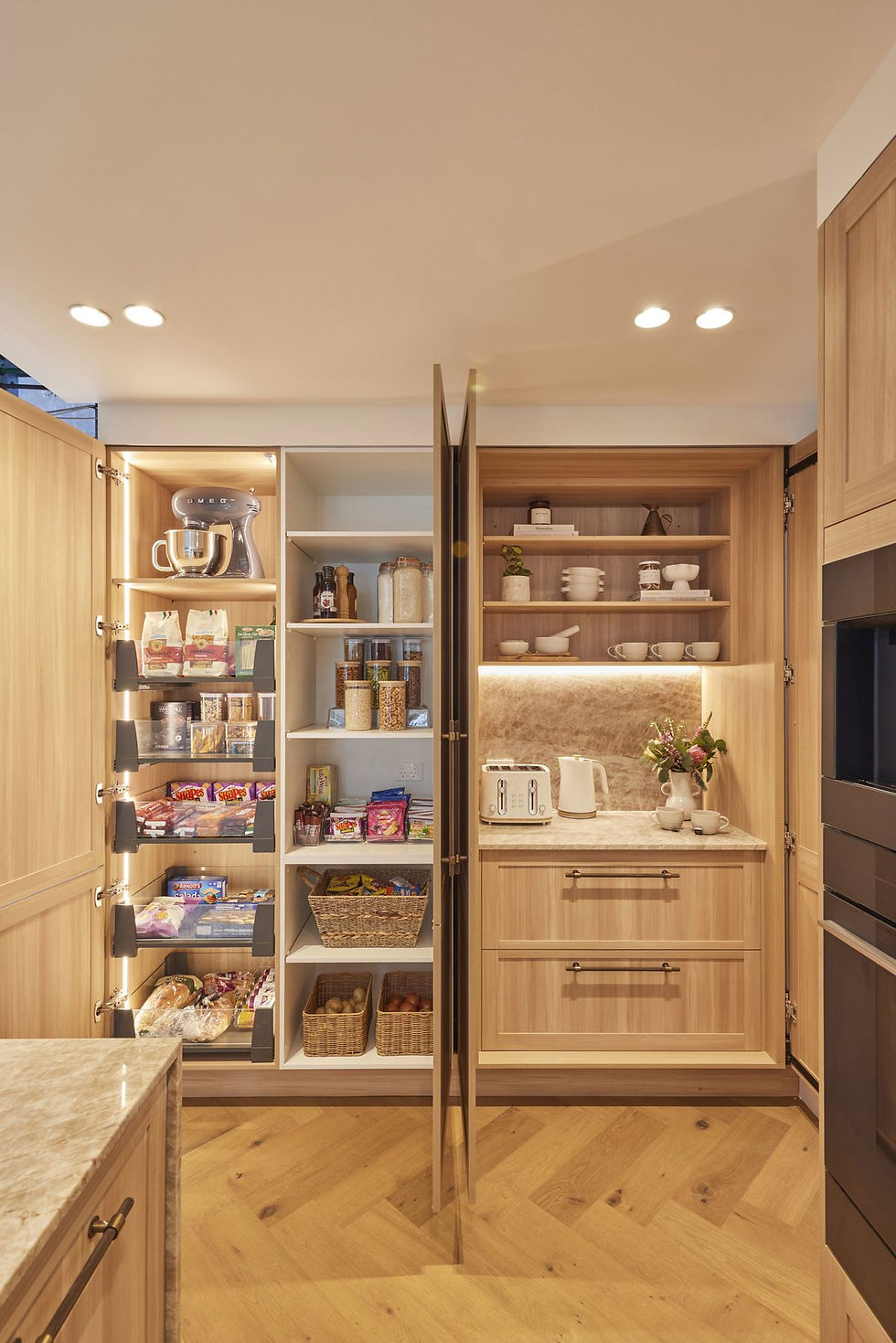
Photo Attribution: Nine
Functionality wise, it’s also a very successful kitchen. We have the pantry and appliance cupboard on the far left, which acts as a ‘butler’s pantry’. The ovens and integrated fridge have been placed on either side of the rangehood and cooktop, although I would have swapped them. A fridge will get used more often and so I would have located it in the middle of the kitchen. This way you have easy access to the fridge from both the ‘cooking’ and ‘pantry/appliance’ zones. I also personally prefer not to have my ovens in such a high traffic area, as it can be dangerous. The only other thing I would change in this kitchen is the sink. The ‘white porcelain’ look really let’s the rest of the kitchen down and unfortunately sticks out like a sore thumb. They could easily have chosen black to match the ovens or gold to match the tapware. I personally would have loved to see an integrated stone sink, so it would disappear seamlessly into the island bench.
HOUSE 2 // Courtney and Grant
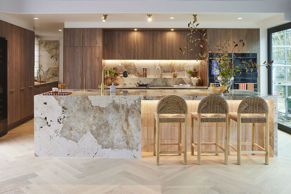
Photo Attribution: Nine
Moving on to House 2, where we have officially left the restraint station. There is nothing restrained about this kitchen and it hurts my brain a little. I’m frustrated because I love all the individual elements, just not all at once. The walnut cabinetry is very on trend but it feels a little heavy in this space. The stone is bold and beautiful, but comes across visually busy. Add in the Moroccan style subway tiles and herringbone floorboards and it’s all a bit too much. Even just removing the tiles from the island would have made a huge difference. Courtney has previously been successful at layering multiple features and styling her spaces but it’s as if she emptied her shopping bags and forgot to choose the best pieces... that, or she had a dinner party the night before and left Grumpy to clean up.
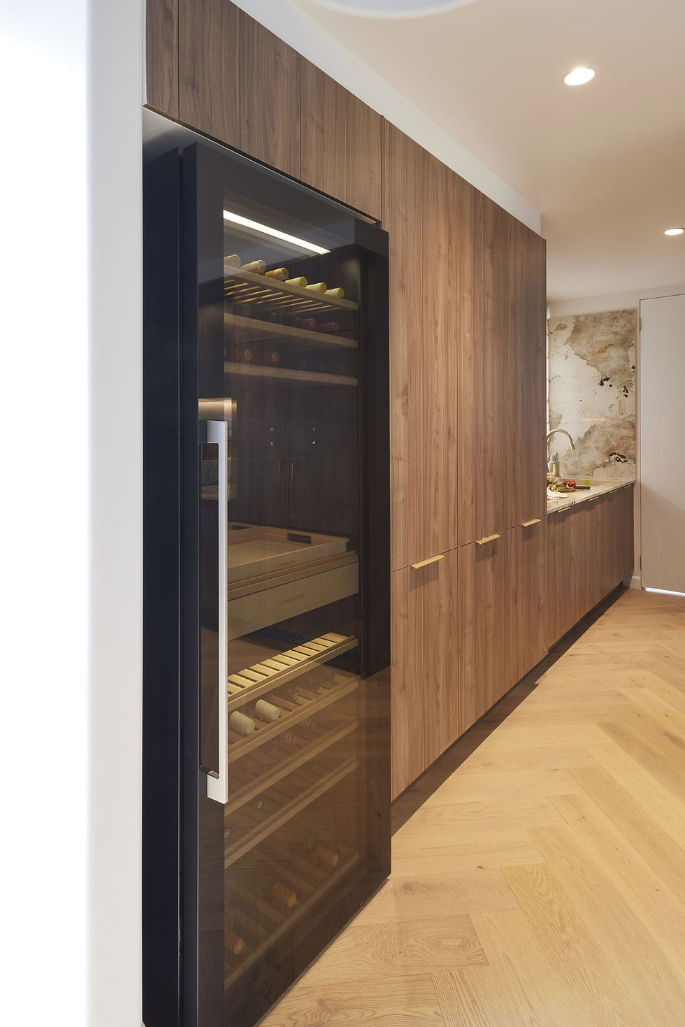
Photo Attribution: Nine
Taking a look at functionality and this is the exact fridge and oven placement I recommended for House 1. However the wine fridge that currently resides on the left hand side is a bit of an eyesore. I would have shifted it down the back, into the ‘butler’s pantry’, where it would be more disguised. It also makes more sense to have an appliance, used predominately for entertaining, located in an area that is used for hiding the messy side of hosting. I am also concerned that the kitchen has a giant wine fridge but only three seats. There aren’t enough seats for a family of four to eat breakfast together, let alone entertain guests or host a party. A large island is only worthwhile if it can be used in its entirety. Three stools are adequate to style the room but the inset in the island needs to be larger to provide the option for more seating.
HOUSE 3 // Ricky and Haydn
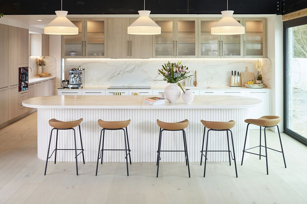
Photo Attribution: Nine
Up next we have House 3, where Ricky and Haydn have finished what is a seriously large kitchen. It’s a similar layout to the first two houses, however it has been designed quite differently in regards to the ‘magic’ triangle. These days’ kitchens have become bigger and more complex, and we now often need to utilise multiple triangles and create zones. The problem here is that we don’t have clear zones or functional triangles. The cooking zone starts on the left hand side of the room where we have two separate banks of ovens separated by a fridge. However the range hood and cooktop are on the other side of the kitchen and the sink on the far side. While I don’t think it will stop anyone buying the boy’s home, it’s definitely giving ‘holiday house’ in that you wouldn’t want to work in this kitchen full time.
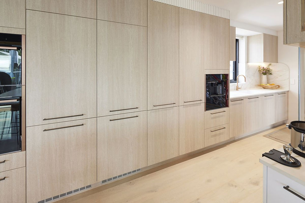
Photo Attribution: Nine
If we look at the kitchen as a whole, the space feels bright and welcoming. The light timber and white combination is classic and suits the coastal setting, however we’ve seen it all before. When using popular materials, it’s important to elevate them and I think the oversized, fabric pendant lights do just that. Unfortunately the boy’s choice of bar stools does the exact opposite. The black/leather stools are more suited to an industrial style kitchen and cheapen the surrounding materials. The surrounding materials, or more specifically the island bench is a great size and I love how you can sit around the entirety of it. However, the double stacked bench looks like they couldn’t afford a thicker slab and painting the timber battens gave it a very ‘DIY’ vibe. The trailing plants, timber battened bulkhead, uneven cupboard heights and grocery store flowers all make the space feel like a local café rather than a multimillion-dollar holiday home.
HOUSE 4 // Kylie and Brad

Photo Attribution: Nine
Let’s take a look at our winners for this week, Kylie and Brad in House 4. Although not an outright win, I’m grateful these guys finally used their Penguin, basically so we can stop hearing about it. Now, if you’ve been with me since the beginning of the season, you’ll now know I’m psychic but for those of you have no idea what I’m talking about, please let me enlighten you. Back in Week 3 I noted that “Kylie and Brad were winners this week; winners of the ‘Penguin Gnome’ anyway. I do wonder if they’ll ever get a chance to use it. My prediction is kitchen week. Big call, I know but I’ll explain if we ever get there”… and well, we got there so now I have to explain. The problem is I can’t actually remember… so let’s just take a look at the winning room. It’s the perfect example of how a space can be both dark and coastal. The kitchen as a whole feels moody, sophisticated and classy. The main finishes work really well together and I love how the ‘Dekton’ benchtop and ‘Woodmatt’ feature cabinets tie in the timber floorboards and stools.
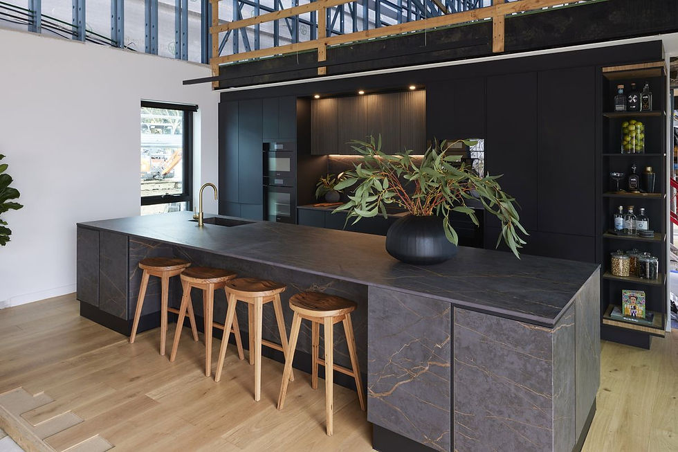
Photo Attribution: Nine
Similarly to House 1, I love the simplicity of the styling. The chosen finishes are bold enough on their own and don’t need dressing up. The eucalyptus arrangement is another subtle coastal touch. It feels organic and architectural, whilst the branches even reference the copper veins in their benchtop and splash back. The only issues I have with this kitchen are actually in regards to functionality. Firstly, I think the ‘FurnSpin’ cabinets are a bit of a gimmick. They provide limited storage and add nothing to the kitchen visually. The banks of ovens are split either side of the rangehood and there is no space to add additional stools. I think all of these decisions are based on the fact that this kitchen is smaller than the others but personally, I would have removed all the spinning cabinets to allow for more stool/pantry space, placed the ovens together on the left-hand side and left the fridge on the right with the additional pantry space.
HOUSE 5 // Kristian and Mimi
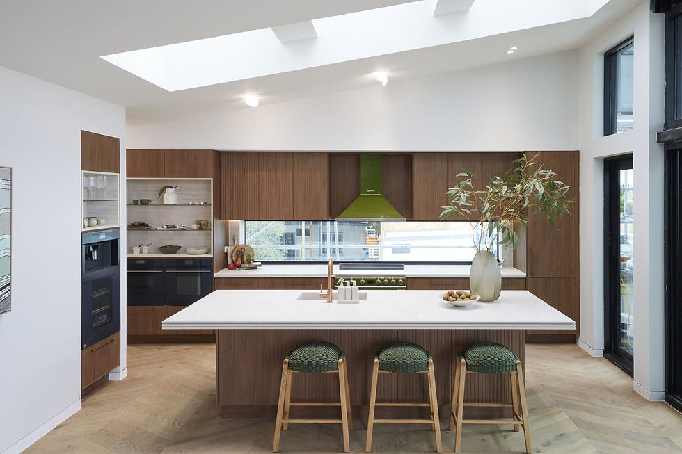
Photo Attribution: Nine
Finally, we have Kristian and Mimi in House 5 who have gone for a modern ‘retro’ style kitchen this week. Let’s start with their layout because as always, it’s slightly different to the other houses. Firstly, we have an island with plenty of room for additional stools, a drinks station built into the left wall and a hidden butler’s pantry. I think the ‘drink station’ is a great idea but I personally would have hidden it in the butler’s pantry with the other appliance areas and in turn would have moved the fridge out into the main part of the kitchen, where it’s easier to access. The amount of pantry storage is great; however, it is split between opposite ends of the kitchen and I don’t understand why they chose to have such large open storage above their ovens. Overall, they have all the amenity you could want in a multimillion-dollar kitchen but I think their ‘zoning’ needs a bit of work.
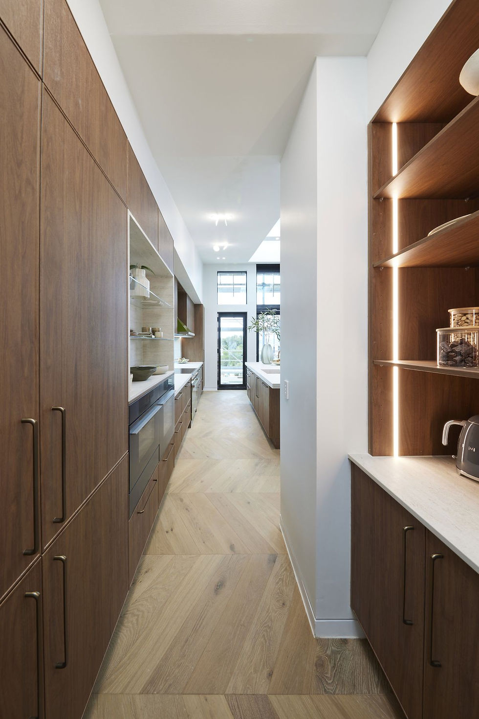
Photo Attribution: Nine
Now it’s time to take a look at the overall kitchen design and I’m going to start with the elements that I like. I love the window splash back. It’s a great feature and point of difference but it also let’s in a significant amount of light. While I don’t love the timber cabinetry finish due to its dark colour and red undertones, I think the amount of light in this room saves it. I also like the way the couple made all the cabinetry the one finish but changed up the profile. It adds interest and depth in a really subtle way. Something that isn’t subtle however, is the atrocious green oven and rangehood. Whether you’re a fan or not, I think we can all agree that it doesn’t look it’s best, sandwiched between dark brown cabinetry. The cherry on top are the green and timber stools that make no sense given they don’t coordinate with any other part of the kitchen and are quite simply, ugly.
Thanks for reading and see you all next week for 5 more guest ensuites. Don’t forget if you’re all for working smarter not harder and would like each week’s blog sent straight to your inbox, don’t forget to subscribe. Which room was your favourite? I’d love to hear your comments and feedback below.
Yorumlar